Visual Design, Creative Direction

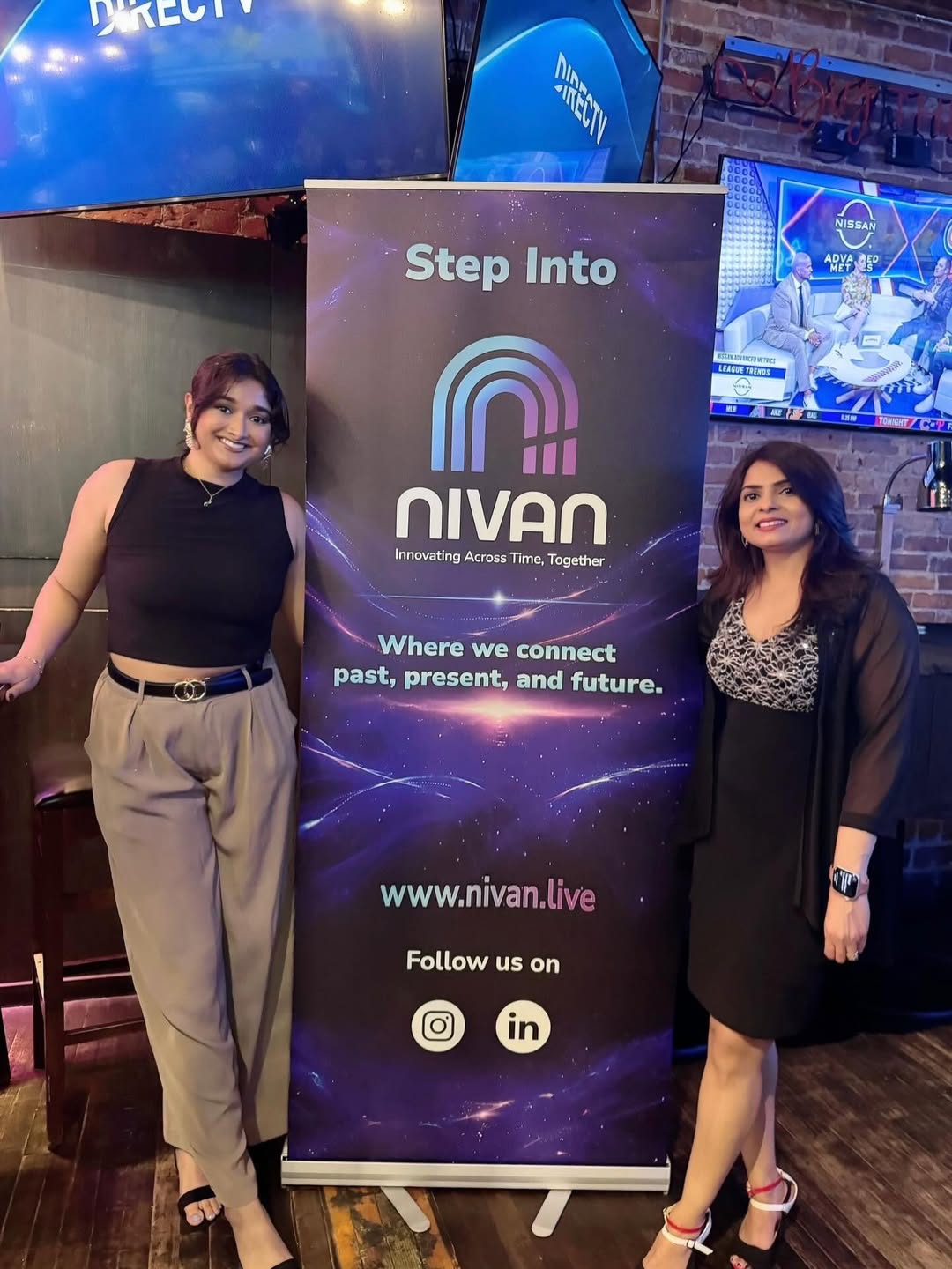
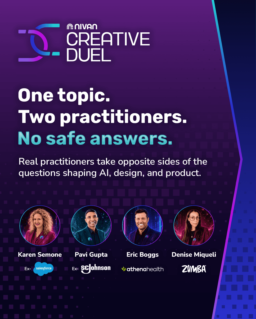
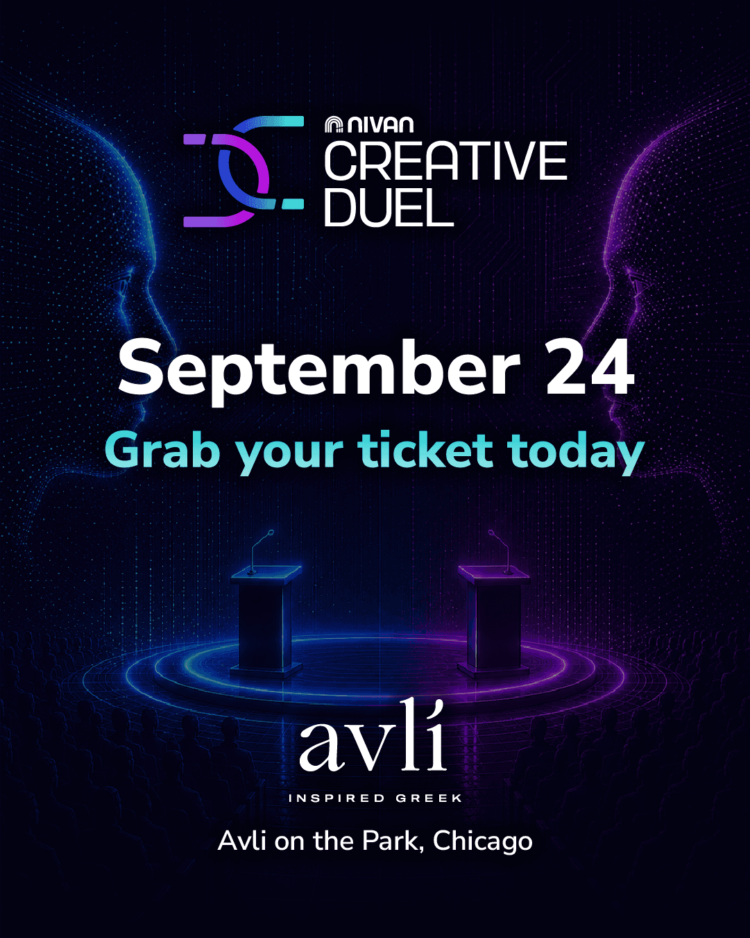
I partnered with the team at Nivan, a Chicago-based tech conference and network, to develop a brand identity. I created the logo and several omnichannel assets.

Logo Variants

Pillars: The three arches represent past, present, and future and suggest movement.
Arcs: The arch forms a doorway or portal symbolizing exploration, while doubling as a hidden letter "N."
Notch: The notch slicing through the arch is a reminder that technology is always moving.

Monogram: Interlocking arcs reused from the parent logo flipped on their sides pick up a "C" and "D" form for Creative Duel.
Tension: The arcs are interlocked and pulling in different directions, much like the core of the Creative Duels themselves.
Logo family: The small Nivan icon and wordmark placed above "Creative Duel" show the sub-brand belongs to the Nivan family.
Sponsorship Package Titles


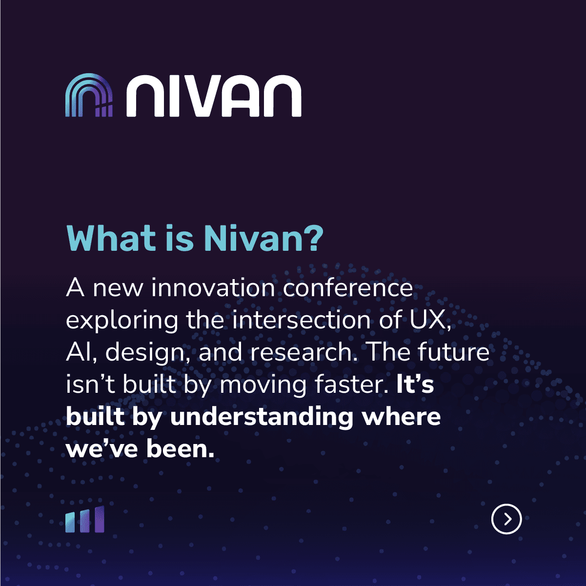
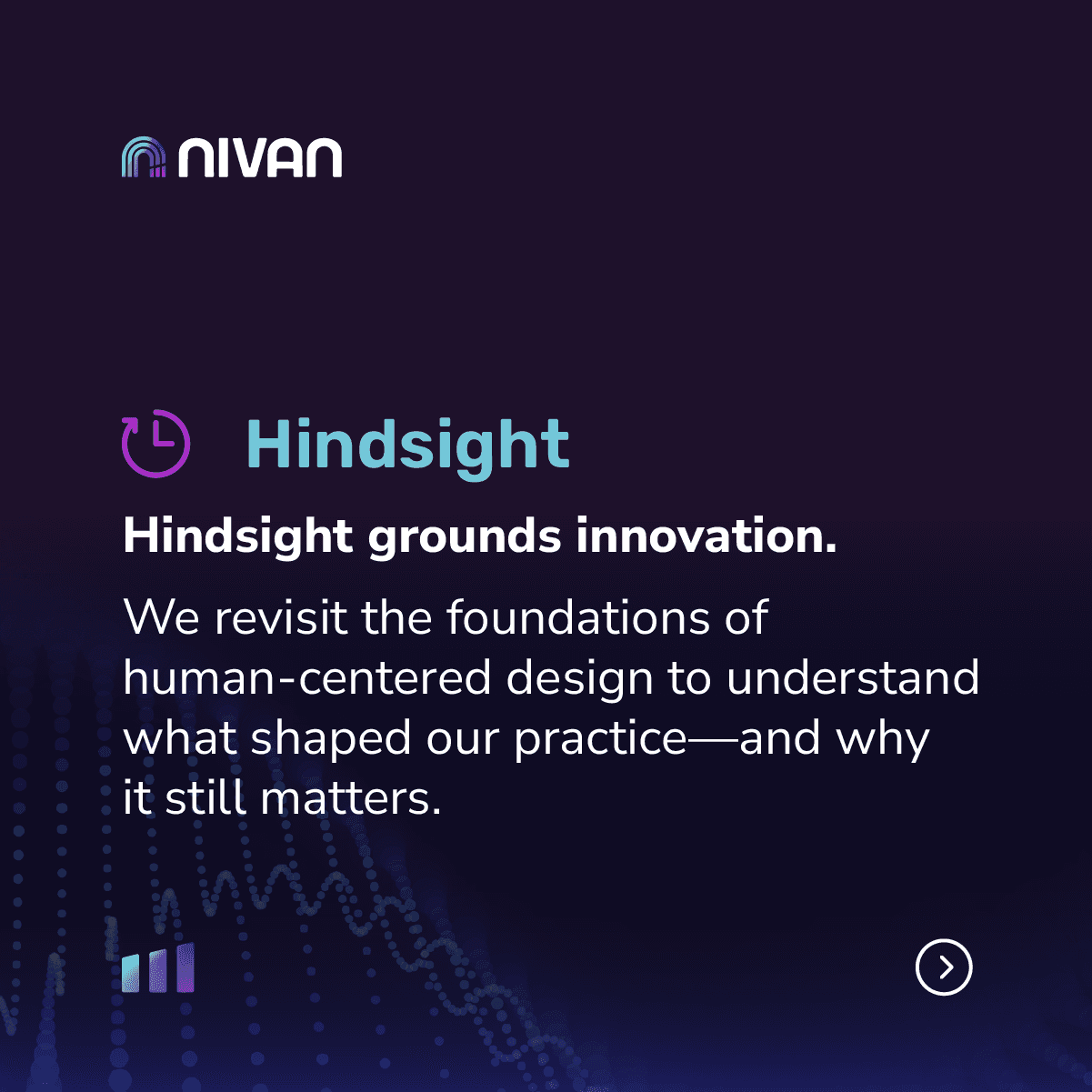
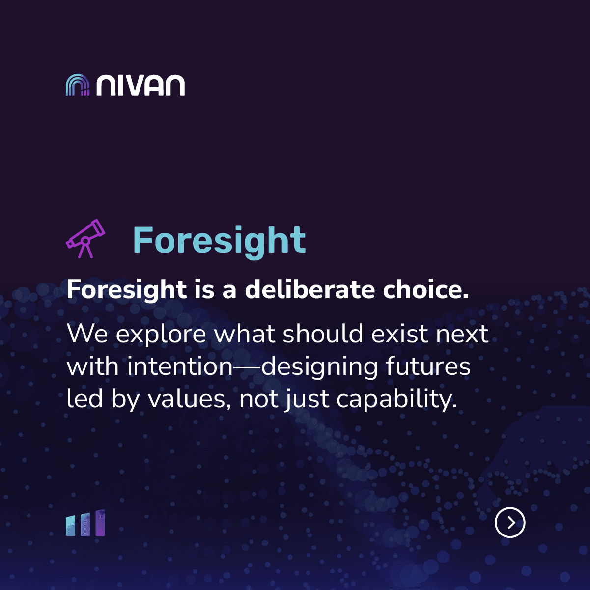
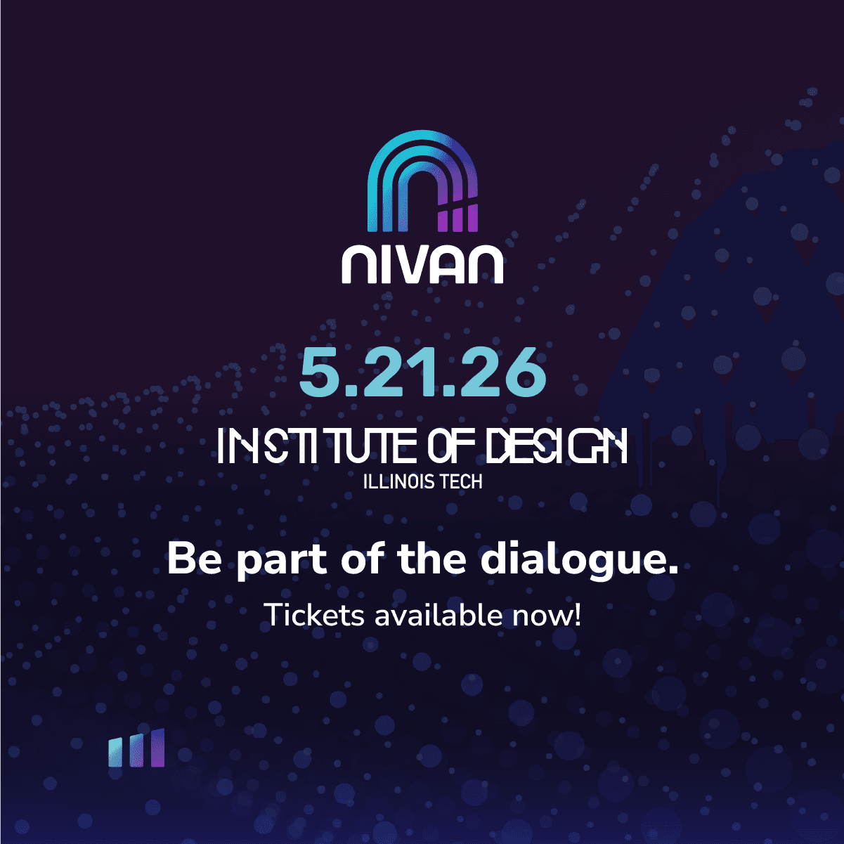
Social Media





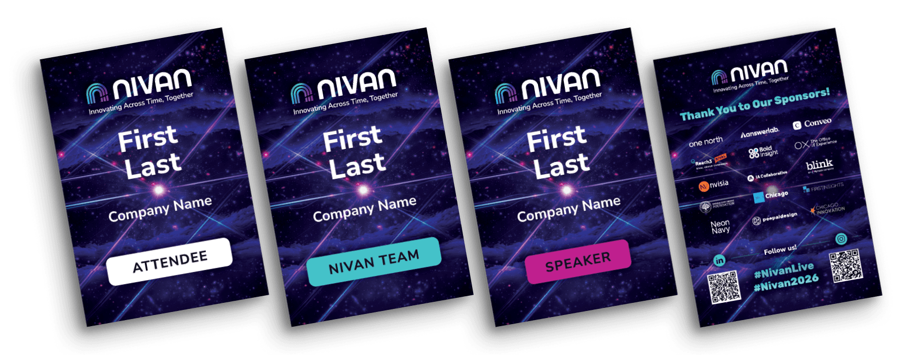
Print Material