UX Research & Design
Nonprfit website redesign for optimizing viewer engagement and donations
After losing her daughter Finley to cancer, Lacey transformed grief into purpose. Inspired by the compassion her family received, she founded the Finley Forever Foundation—a nonprofit that supports families battling pediatric cancer.

Project Type: Academic practicum, nonprofit organization

Timeline: 9 weeks

Teammates: Ana Ignatescu, Ishan Dutta, Tanvi Dalvi, Gurusha Raskar, and Han Tran

My Role: UX Researcher, UX Designer, UX Strategist
Challenge:
My team partnered with the Finley Forever Foundation to address digital barriers and expand their reach. We revealed limitations on the site's effectiveness and user engagement through a website audit and aimed to make the website more impactful and inspire more viewers to take action so the foundation can help more families.
Solution:
We redesigned, rebuilt and optimized the website, focusing on intuitive design, clear content architecture, and mobile responsiveness, backed by user-testing, feedback, and data. Strategic calls-to-action now guide visitors toward engagement, while updated branding and streamlined processes enhance both the user experience and internal efficiency.
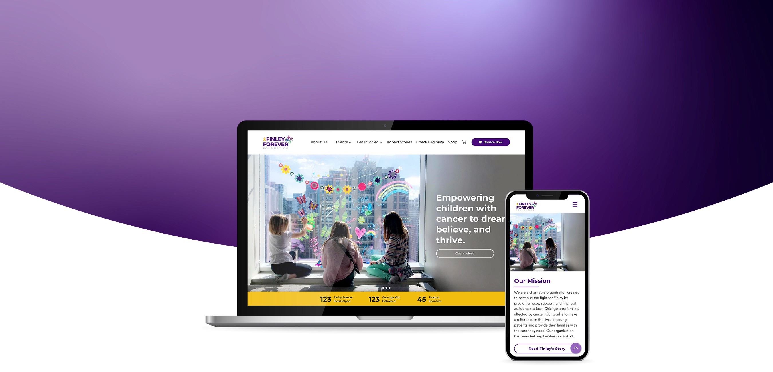
Finley Forever Website (prototype)
responsibilities


Usability testing


Continued volunteer work
toolkit


Getting started
Website audit
Our website audit revealed vague and disorganized content, inconsistent branding, an inflated navigation, and an inefficient merchandising process—all of which limited the site's effectiveness.
Sample of original website pages

Content inventory
To understand the content on the existing website and find the gaps, we conducted a content inventory. A comprehensive overview of the existing content, including text, images, and videos.
Quick takeaways:
Repetitive sections and content
Lack of persuasive/impactful writing
Pages like “Application” were missing calls to action
The navigation hid several pages into a “more” dropdown
Quick view of content inventory

Open card sort
Using the content inventory category items as “cards,” we conducted a card sort in Optimal Workshop to learn users' mental models of how they categorize the content.
# of participants: 6
# of cards: 25

67% of participants consolidated specific event cards into one group

86% categorized the "Amazon Wish List" card under Donations

100% of participants grouped tax information card with the donation section
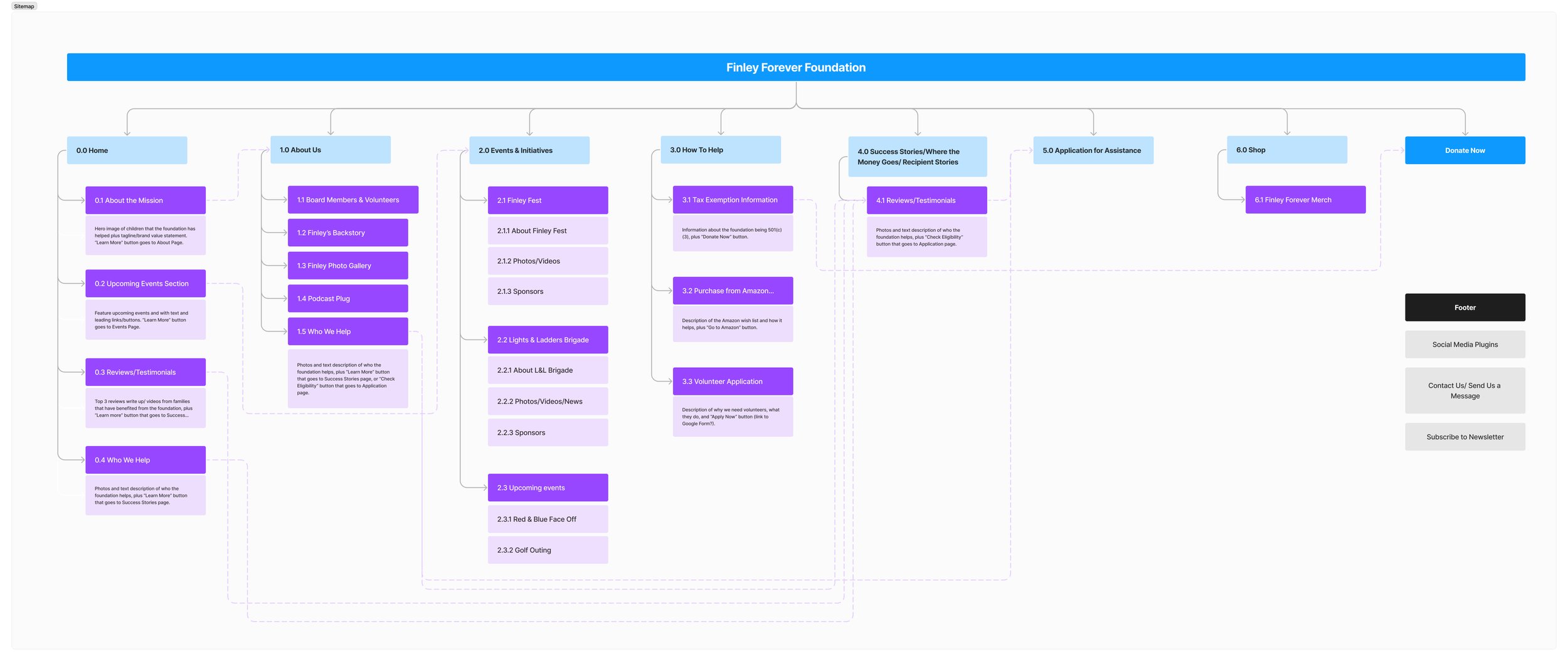
Updated sitemap
This updated sitemap reorganizes the existing content and includes areas for new content and action items strategically placed in the navigation.
Home | About Us | Events | Get Involved | Stories | Application for Assistance | Shop | Donate Now
The audience
Meet the personas that guided the website's design and content creation. Each user presents a unique motive to explore different aspects of the site.
The interests of each persona inspired the scenarios and tasks for our tree jack and user testing studies.

Community Member
The website must appeal to, educate, and entice visitors to donate, attend an event, or get involved

Potential applicant
Potential applicants must review the eligibility guidelines to determine the best way to request support

Medical Professional
Medical professionals must easily understand how to refer their patients to receive the benefits of this program

Business owner
Businesses might want to partner with the foundation and learn about sponsorship opportunities

Potential volunteer
The organization must show users the impact that they can make and be easy to apply to volunteer
The design process
Wireframing
Each team member individually created a low-fidelity homepage wireframe. We combined the best features into a unified design below.
Homepage wireframe

Next, we divided the pages among the team and moved into high-fidelity design and prototyping in Figma, adhering to established brand guidelines.
Usability testing
Moderated user testing
Protocol
The team conducted moderated user testing via Zoom to assess ease of use and overall impressions. Participants shared their screens and "thought aloud" while completing nine tasks. Each researcher independently tested 1-2 participants, following a curated script for consistency.
# of participants: 7
# of Tasks: 9
Average success rate: 77%
Sample task-based prompts:
Locate where to make a monetary donation.
Learn about real people the foundation has helped.
Check eligibility for assistance.
Donate to Stem Cell Courage Kits.
Learn about volunteer opportunities.
Results
Key Findings:
Recommendations:
100% of users located where to make a monetary donation, but just 42% successfully located where to donate to Stem Cell Courage Kits

Utilize the general donation button to create a centralized hub for all donation methods (monetary, special events, stem cell kits)
2 users noted that the donation landing page in Square felt impersonal and "transactional," stating they wouldn't want to donate
This led to further research on donation best practices and platforms. The client decided to switch from Square to Donorbox, a platform specifically designed for nonprofit donations
63% of participants stated that they found the eligibility guidelines unclear
We included text that only medical professionals can refer patients for financial services and advising viewers to consult medical staff. We also added a detailed FAQ.
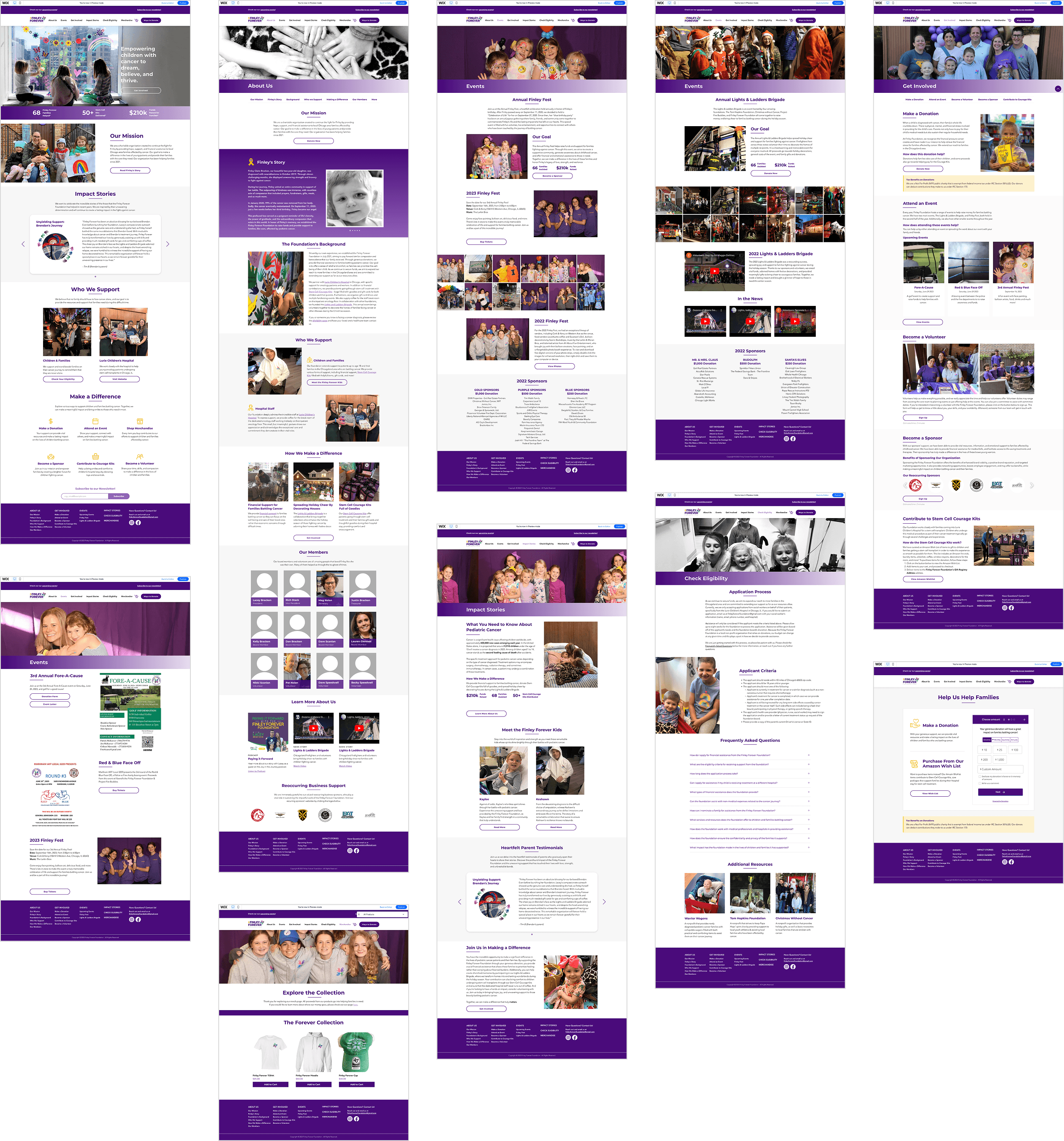
High-Fidelity design
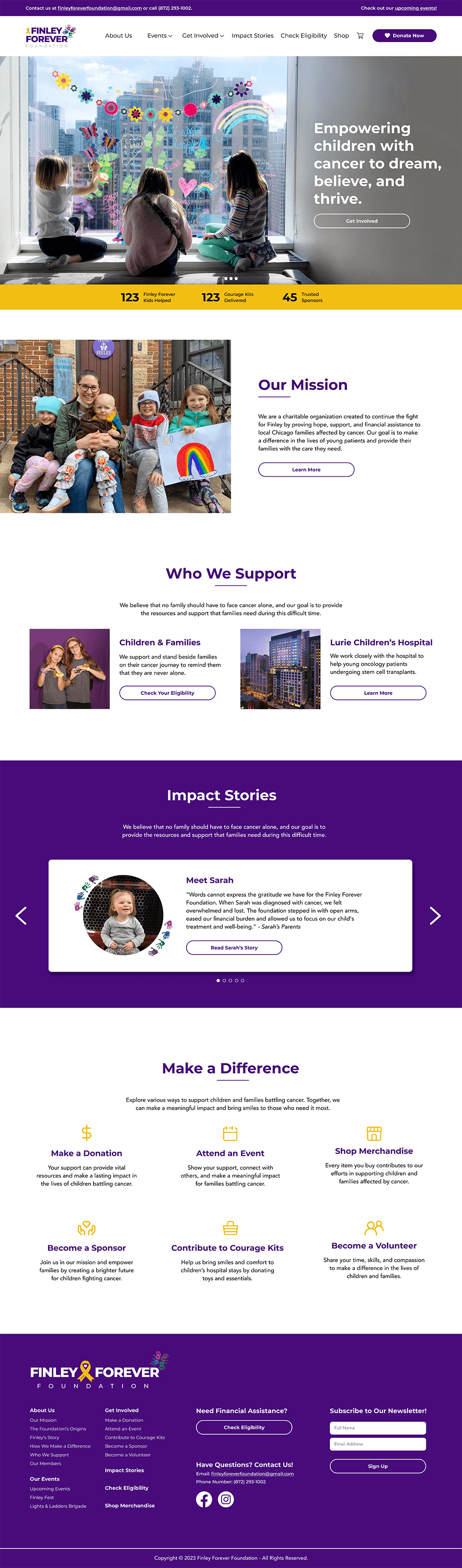
Homepage
The updated navigation consolidates the main calls to action and includes a prominent donation button.
The content builds an emotional connection through sections "Who We Support" and heartfelt family stories.
The page concludes with various calls to action, guiding users to how they can make a meaningful impact.
About Us
This page contains all information about the foundation, including the background, and Finley's story.


Get Involved
This page consolidates various methods that the viewer can get involved including making a donation, attending an event, becoming a volunteer or sponsor, etc.
Check Eligibility
During testing, users mentioned that they did not know whether they were eligible for support. This dedicated page includes information about the application process, eligibility guidelines, and a robust FAQ.

Donation
Clicking the Donate button will lead users to a donation hub, offering all three ways to donate. This allows viewers the freedom to choose where their contributions go.

Reflections
Design for impact (the Inzovu curve)
People are more likely to act when they feel inspired by emotions — maximize impact by telling stories that spark empathy, avoid despair, and end with hope.

Set schedules and checkpoints
Large, multi-phase projects (e.g., research, design, development) benefit when clear checkpoints are in place that allow for responsibility and accountability.

Remain flexible
Throughout the process, various challenges are likely to arise—expect the unexpected and be flexible.
